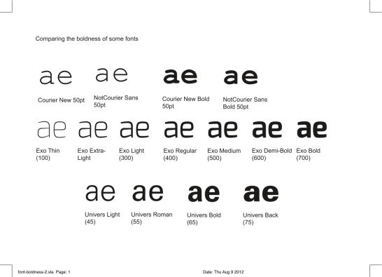
As I’m exploring the aesthetics of monospaced fonts, and their potential (mis)use as proportional body text fonts — similar to the work done by OSP and LibreGraphics Magazine on the NotCourier Sans / PropCourier Sans font [1] — I noticed this:
The extremely widespread Courier New font (and it’s derivates Nimbus Mono L, Tex Gyre Cursor, GNU Free Mono, and NotCourier/PropCourier) at it’s regular size is very thin, compared to the average font weight. It’s actually much closer to the “Light” or “Extra-Light” variants, compared to fonts with rich families, such as Univers or Exo [2].
That’s why it’s very difficult to use it for anything else than headlines, it’s just too thin for paragraph/body text. I think it would be worthwile to produce a slightly bolder version for body text — something like a PropCourier Normal/Regular/Roman.
To be continued…
References:
[1] : by Manufactura Independente – http://libregraphicsmag.com/propcourier.html
[2] : by Natanael Gama – http://www.ndiscovered.com/index.php/exo-font-family

One thought on “Investigating the boldness of some fonts”
Comments are closed.