Here are live conference notes taken Thursday October 25th during the Books in Browsers 2013 conference at the Internet Archive, San Francisco.
See an index of my live notes here.
Usual live blogging disclaimer :
These are informal notes taken by me, Manuel Schmalstieg, at the event, and may or may not be similar to what was said by the people who spoke on these topics. Probably if something here is incorrect it is because I mistyped it or misunderstood, and if anyone wants corrections, they should email me – or post a comment. Thanks!
TOC:
Session 1: Beyond Intuitive UI
Design Considerations for Attention, Rhythm, and Weight
with Allen Tan, the New York Times
Good morning,
digital editorial designer at NYT.
there has been a new form emerging on the web. using scrolling, image, text, bringing all together.
has seen lots of imitation around the web.
if you’re interested in “Snowfall“, and thinking we should “Snowfall” all the things – just don’t do that.
It was a particular form design, for a particular content. Doing it without consideration for the context and the process, is a shame for your content.
Develop other forms that will do more justice to your content.
Adjectives that were used, that I find most frustrating, are “intuitive” and “immersive”.
they are so vague, everyone knows what the person means, but you don’t have enough language to understand what the person is saying.
The first thing i want to point to : a talk that Tim Carmody did at fCm “Paper modernism“, 1850s-1950s.
we talk a lot about Gutenberg revolution, w’ere in the network revolution now. but in between there were other revolutions, that brought modern media
cinema
telegraph
typewriters
advertisements
all these things were about how people relate with information.
information became more visual, spacial. they were bombarded, in ways not so diff from where we are today.
we look back at these things now, they seem obvious. being “intuitive” in large part a question of literacy.
things need to be legible, they need to know the metaphor, they need the right skills.
when you look at an app on your ipad, how do you know something is “scrollable”. they are some signals – scrollbar on the side of the screen, text that runs off the edge.
legibility is about having cues, signals.
Metaphor : in the case of scrolling, there’s the vertical scroll, rolling up or down. another metaphor is panning a window.
the skills that you have to pickup. ability of using a mouse, a scroll-wheel . people using computers in a library. wheat they struggle with is: a single click, or a double click. skills are expensive. you just have to learn them.
when the iPhone came out, every commercial showed the gesture of “pinch and zoom”: once you saw it, you could do it easily.
see at the 3 layers, and see what the problem is. Legibility is easy to fix.
but if the reader doesn’t have the skills to navigate, that’s a much deeper problem.
About “Immersive”.
people are not meaning “getting lost” in a virtual word. it’s more about the fullness. other word: “Cinematic”. its an easy trap to imitate another form without understanding how it works.
((shows a review by film critics)) the director picked up techniques (of Kubrick), without understanding them.
The new flickr site: makes the photos as huge as possible. it loses a lot of what makes flickr rich.
A movie from Argentina (Historias extraordinarias). the images are almost a backdrop, its almost all narration. there’s this amazing density to this 3-4 hour movie, switching between the textual and visual.
This was a review that someone gave: it was “Like reading a novel”.
Attention
Attention : much of it is like in a film, deciding what is foreground, what is background. on a webpage screen, you look all over the browser before focusing one something. once you start reading, your eyes focuses on a piece of body text, a narrower frame. if something tries to catch your attention outside the current frame,…
you see this in scrolling-storytelling pieces.
Rhythm
has two components. Pacing. You sometimes want to break someone out of their frame. moving from one chapter to another. or one major idea to another.
but you cannot do that for every single image.
sometimes an image is supplementary.
we have to expand our range of design elements.
small-size images, secondary images…
other component: sequence.
it addresses “what part needs to go where” and “how to you bring the reader to those diff elements”.
Weight
something we mostly don’t understand when defining interactive elements. we don’t have specific vocabulary to explain why something feels “light, flimsy”:
talking about tactility of a physical book, about how things react to our hand. we can get a lot of that with digital media, but it’s not about the smell of a book, the paper texture.
when interacting with multimedia … we can look at sister industries, battling the question of weight for a long time. animation, movie animation. excerpt from a book, “the animators survival kit”. a character trying to pick up a rock – how to convey the sense of heaviness.
you can see how he ‘s struggling to pick it up. we work with the sense of anticipation.
right now , many animations are regular, predictable. we work with easing modes, trying to define the start and stop.
another industry. the video game industry. more than any other interactive form, they have to deal with controllers, how to represent things on screen , responsiveness, user feedback.
an example (name of game): each weapon has a different feel. quotes from an interview with the game developer – trying to understand the things a dev had to do to make the weapon feel like it is.
These questions are generalizable to any form of digital storytelling. they are some initial parameters.
i hope people start looking at those factors more. to build a better form of storytelling.
Session 2: Designing on the Edge
Digital Paratext and the New Reading
with Corey Pressman, Exprima Media
this conference is really blowing my mind.
things are starting now!
applause – “see you next time”
exprima media is a digital consulting organization.
i’m on the front line of helping people doing digital things that look beautiful.
((some examples on screen))
not just apps, but every digital experience. we’re talking to publishers, documentary filmmakers – they have wide possibilities, beyond film. people begin to see how big an enterprise it is – and people in this room know how easily it can fail.
(drops laptop on the floor)
some of those slides have been seen, i promise to retire some of them after this talk.
lets’ start wit this, what it is?
a rock, but so much better
it’s the first tools, made some 3.7 mio years ago. pre-human tools.
and there’s a line between those tools and your iphone. not such a long line in geologic terms.
these creatures were carrying them around.
they were relying on artifacts. culture. an idea made manifest, in order to exist.
it was a roaring success.
they could live in other environments.
this was the first mobile, handheld technology, that propelled our species into another way of living.
as soon as you get homo sapiens, you get another thing. what is that? a cave painting, yes. #mentalvomit. don’t tweet that.
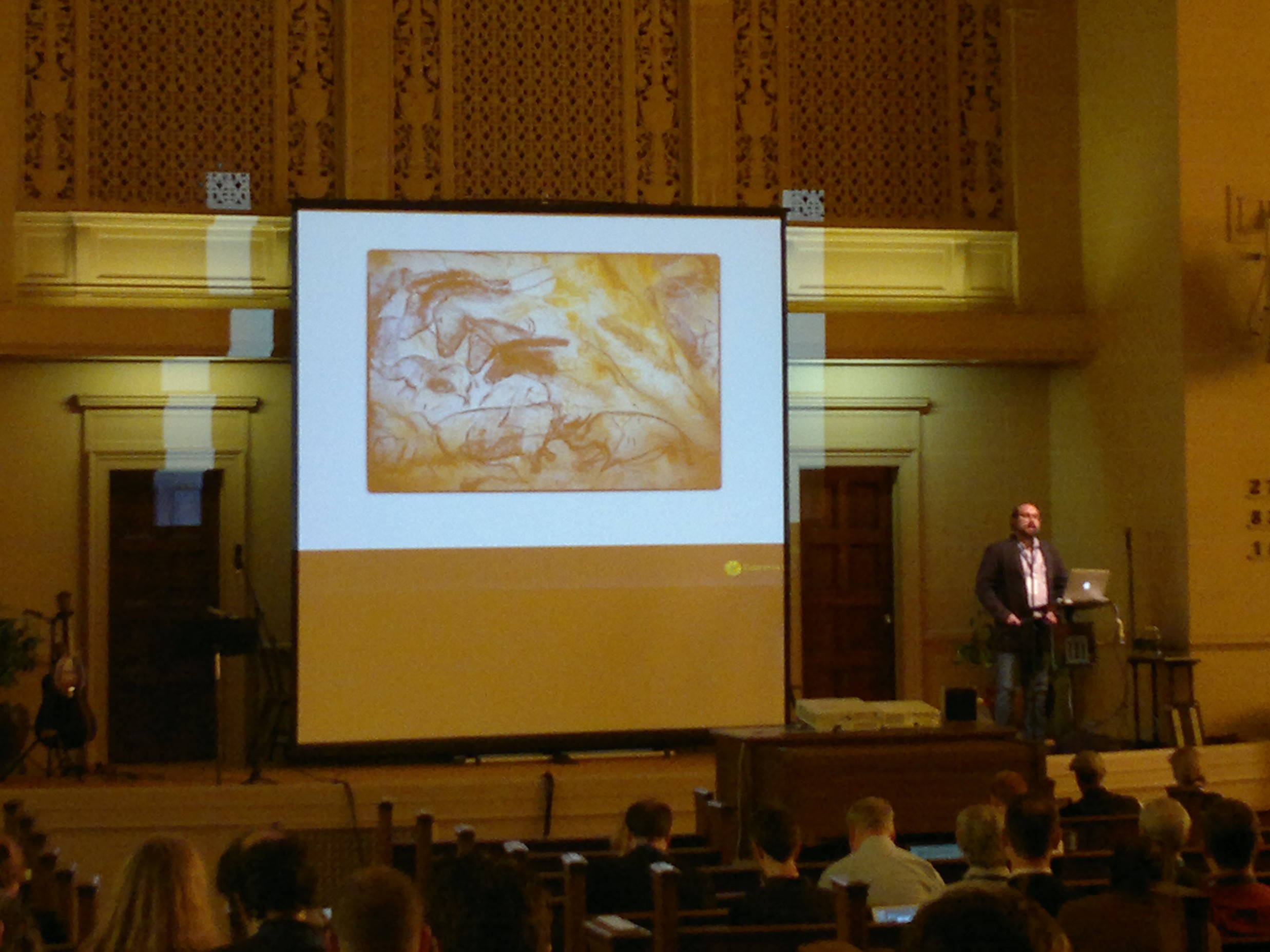
it’s a different kind of artefact than a tool. it’s taking mental pictures, and manifest them. a message, content, in a container. the very beginning of that.
there’s another thread here. it’s a very human act: storytelling. we are storytelling creatures – we, and the bots on amazon that scare me.
a period of orality. for a super long time, there was the orality period – you could communicate in shouting distance. face to face, using their mouths. an enormous time. there’s a lot to learn from orality. that’s my shtick here. looking back as we march forward.
oral = aural
you can turn vision off, you cannot turn your ears off. it’s 360 degrees, multisensual. you see how it’s different from reading?
there’s something in oral cultures – authorship was a different thing entirely. stories were told and retold, nobody was really the author. there was the *teller* of the story.
marshall mcluhan called it “haptic harmony” – nice.
it went away because of writing. they started writing to keep track of stuff. but hey, we can write down Gilgamesh with this!
but if you write Gilgamesh down, it becomes static. and writing was controversial. “It will bring forgetfulness. You equip people with a semblance of knowledge.” who said this? Plato/Socrates.
((quotation about writing and painting))
what is painting not? it’s not interactive, it’s not a dance, it’s not orality.
books create a whole new era, it’s kind of upsetting, it kind of makes me sad, to lose all that orality.
“Written works are written in solitude, and consumed in solitude” .
writing is dissituated, it can exist without the writer. print culture is static. it’s flat, non-dynamic. its based on “authority” – there’s an author, a voice.
“WRITING SUCKS AND ORALITY IS AWESOME” – but obviously writing doesn’t suck … it is always to some extent, resisting this frozenness. that static is going away now?
YES:
but here’s evidence of that staticness being resisted:
((shows image of a rare codex, heavily annotated))
they wrote in, having a conversation!
books being passed around and written-in, a social media event. read-write!
text with multiple authors that changes through time! the COran: commentary becoming content. THe book itself becomes an evolving form.
Paragraphs, punctuation, figures, footnotes: platform specific protocol.
Amazing book: “Paratexts” – Gérard Genette
(A zone between text and sub-text)(Reads the quote)
talks about all the visible and sociological bubble that surrounds a book.
then this happened: binary (screen of 00s and 11s)
along with the advent of binary comes something else. around the same time, the advent of radio and television was freaking people out.
(quote from 1930s about radio) – potential for secondary orality – orality returns, through digital media.
we can use our digital tools to bring that stuff back, if we are really careful about it. coming up with new Paratext, and being very careful about it.
what i’m hoping today, is to make us all make true, – let’s become Paratext designers.
Session 3: Astrom/Zimmer
with Anthon Astrom and Lukas Zimmer,
i’m gonna to show in-progress stuff. things we are working on right now.

we’re doing research-driven work.
some with universities.
some self-initiated projects
some research flowing to commercial project.
talking about self-initiated stuff today.
our main motivation.
has a lots to do with space, and context. these works have resulted in a prototypal interactive web applications.
frameworks.
we are designers, creating frameworks to fit into, without knowing what the context is before it’s there.
digital paratext.
ways for creating connections between types of content.
space is important.
two levels.
on-space. it’s, in books, pages – space that we look at.
we have context through hierarch, headers, body text, footnotes.
and context through simultaneity – articles in a newspaper.
context builds anchors.
the smell and texture of books is also important.
what happens, when we go digital.
the flipping of pages, going to bookstores…
googling, amazon, friends suggestions from facebook – it’s great because is’t really efficient, fast.
but we also simplify things really a lot. we go flat again. we go back to an non-space, the screen.
all the interaction with people, the tactility, is blurring. there’s a lot of uncertainty going on. it doesn’t really fit into this digital thing.
statistics. a binary view of the world.
it becomes a lot smaller, has to fit into our pocket.
we get a steady stream of fragments, lists that are algorithmically calculated.
it’s cool because it’s fast and efficient
we didn’t get MEMEX, we didn’t get Vannevar Bush’s .. … where we would always get the source.
it simplifies things down, dangerously.
that’s the motivational force behind what we do.
((shows projects on screen))
the first two project, is called “Lines” (“interacting with an idea”) lines.thecafesociety.org
the idea: the text is comment on text.
everything you write is a comment on something written before.
in the old scriptures, the limitation was the paper.
((logs into the backend of a custom CMS)
you create this kind of sandbox.
you can write to other people, or to yourself. it always has a starting point.
((enters lorem ipsum))
annotating a part: a form in the right column.
i can comment on a paragraph, a word.
every comment adds another column.
it can get very complex!
it can grow really big. this is a dialogue between two people. because it is digital, i can step in at any point, and see the development of an argument.
((zoom in ))
i can read it, from the beginning.
it’s a playground, we are playing things out.
Next project.
Perspectives.io
a lot simpler, but a lot more difficult.
it’s more an organizational environment.
on the left sidebar: information that you collected through bookmarklets, or uploaded.
there are books, ((book cover showing up))
((on screen: a canvas, where things can be arranged on a gradient background, as colored circles))
it gets more interesting when the background changes:
example : a map.
when you mouse over a surface, you get more information.
other example: a group photograph. you can annotate photo information about different people.
where it gets interesting, is with more conceptual spaced.
a map of books :
informs by practical work / my theoretical work.
supporting / irritating
the background creates a context.
it’s complex, it’s a way we’re not used to communicate.
but it opens up: you have to start thinking, make an effort.
We love this idea (from 2007), but wanted to make it fit into the economy of mobile, small mobile screens.
We stripped things down.
((circles and dots))
a x and y axis.
strip it down to one axis.
we can put many of them next to each other, we get hack to complexity.
– “but these are just sliders”?
– “sliders for conceptual values”
Back to “Lines”.
How do you get to the point where it is interesting, and easy to find a particular piece?
– We added a navigational layer.
Example on screen: a library of Suhrkamp books.
THere are tags. but it’s different to add a binary value to them. they have gradient values.
“For a better world” – scale
“Would read it again” – scale
“Influence my work” – scale
((Shows Triplecanopy, new york art magazine))
apply that gradient tagging to a big archive. if you have a lot of tags, lots of editors, you get a lot of meaning out of it.

the user can filter through the archive.
a visual index.