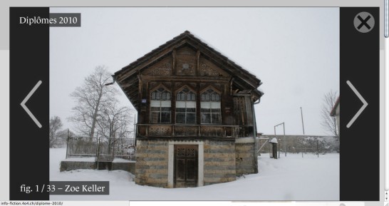
Yesterday, I finally tackled an overdue task: I created a modified ColorBox version, in order to achieve the most perfect LightBox/ThickBox/whateverBox-solution ever seen :)
If you don’t know about LightBox, ThickBox, or ColorBox: that’s those little scripts that build slideshows from a series of images. There are gazillions of them, and you find them everywhere on the web. They all do pretty much the same thing, with subtle differences.

If you are building websites, at some point you will use one of those scripts. You will read dozens of blog entries titled “jQuery lightBox vs ColorBox vs FancyBox vs Thickbox” or “10 jQuery LightBox Plugins”, and finally settle with the one that works best for you.
In my case, that was ColorBox: I don’t remember what were my specific criteria, but it was something like that:
- Has a default theme that’s minimal enough not to interfere with my design.
- Has intuitive navigation. Clicking on the main image means: “show the next picture”, rather than “close the gallery” (hello Thickbox).
- Adapts to the screen width, by making large images small enough to fit the screen.
- Works for non-English sites by using icons rather than “next”, “previous”, “close” labels (hello LightBox).
- Has code on GitHub and is actively maintained.
From then on, ColorBox was my default solution when I needed to quickly implement a gallery/slideshow. But I also became aware of some shortcomings, and decided to fix those:
- Too small navigation and closing buttons (20×20 pixels). In the age of tablets and touch screens, the buttons should be much larger.
- “Previous” and “Next” arrows should be placed left and right from the main picture, rather than grouped at the top or bottom.
- The title of the page should be displayed at the top of the gallery.
- In WordPress, it should not display the Title field of the image (which, in the real world, is most of the time something like “DSC200048.JPG”), but rather the Caption field.
Have a look by yourself:

Basically, what I was heading for was an update of the ColorBox design for the tablet era, along the lines of what we see currently in Facebook, Google+ and the new WordPress Jetpack carousel.
Actually, it wasn’t that much work:
- Items #1 and #2 were easily solved just by changing the CSS, and providing some custom icons.
- For #3 and #4, I had to digg into the
jquery.colorbox.jsfile and apply some modifications, but it’s rather straightforward as well. You can have a look at the diffs on my GitHub fork (link upcoming).
The result:
Some additional tweaks:
- Since the caption field will be empty half of the time, I added a conditional check to avoid having an empty field in my markup (since I am styling it with a background color, it would be visible).
- I combined the “Current image” number with the “Caption” field, in order to position them coherently.
FYI, the font seen in those examples is “Le Monde Journal STD”, served by TypeKit. The navigation icons have been designed with Sketch (using the latest beta build, otherwise the drop shadows wouldn’t render correctly).
Wanna see a live example? Look here:
https://head.hesge.ch/information-fiction/diplomes-2014/
This solution was developed for the Information/Fiction website, currently operating in beta status.


Wow, what an awesome patch for colorbox! I have to agree with your title – Definitely the Ultimate Colorbox! :)
Now if only we could get your version hosted at a CDN somewhere.. like cdnjs.com
That would be fantastic.
Look here:
https://github.com/ms-studio/colorbox