Using the Microsoft online tools (Teams, OneDrive, Word…) with my colleagues and students, I am often facing the choice of flying with the default typeface, or selecting another one among the fonts proposed by the platform.
Every now and then, I spot some new additions in that font menu, such as two years ago (in 2021), when five new contenders for “Microsoft’s Next Default Font” appeared (Tenorite, Bierstadt, Skeena, Seaford, and Grandview). Read the 2021 article by Si Daniels for Microsoft Fonts.
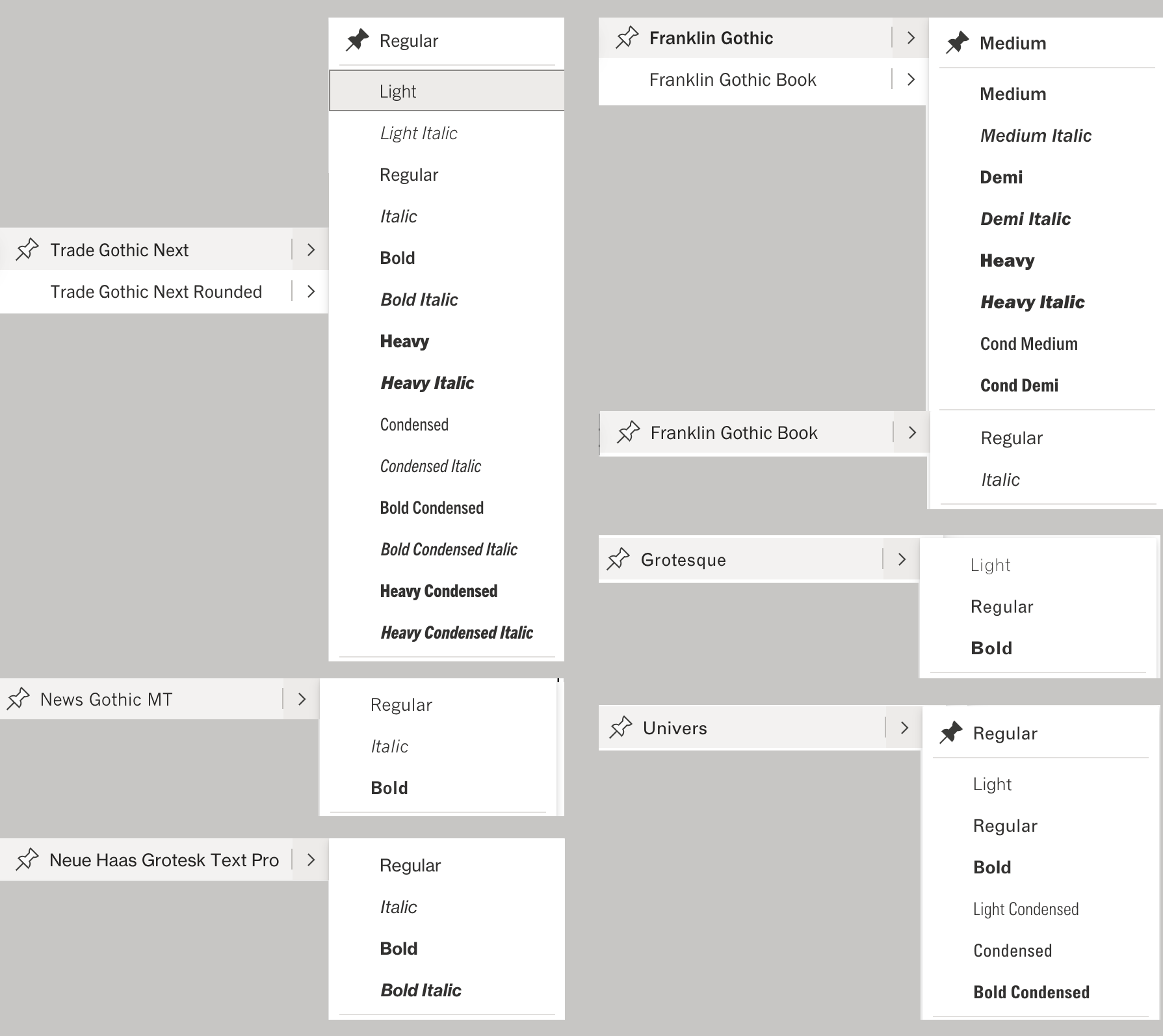
I spent some time exploring that font menu, and had a deeper look at the various “clean and professional sans-serif typefaces”. I found there’s a surprising mix of classic early twentieth century gothic fonts. Among them, ordered by the date of original design:
- Franklin Gothic. Available in four weights, with italics. Originally designed by Morris Fuller Benton in 1902 for ATF, extended by Victor Caruso as ITC Franklin Gothic in the 1970s.
- News Gothic MT. Originally designed by Morris Fuller Benton in 1908 for ATF, revived by Monotype in 1962. Only three styles: regular, bold, italic.
- Grotesque. Seems to be Monotype Grotesque (aka Monotype Grotesque 215). Released around 1926.
- Trade Gothic Next. Originally designed in 1948 by Jackson Burke as Trade Gothic. Trade Gothic Next is a redesign by Akira Kobayashi and Tom Grace by Linotype, released in 2009.
- Univers. Originally designed in 1957 by Adrian Frutiger. Only three weights: light, regular, bold, as well as condensed. Italics not available. According to Microsoft: “This font is primarily meant for use in displaying Hindi text in documents.” Copyright 2014 Monotype GmbH.
- Neue Haas Grotesk Text Pro (2011 – 2012). Original design in 1957 by Max Miedinger as Neue Haas Grotesk (which later became Helvetica). Redesigned by Christian Schwartz in 2011 for Linotype. Available in two weights: regular, bold.
- Bahnschrift (2017): a digitization of the famous DIN 1451, developed by Aaron Bell for Microsoft, released in 2017.
- Grandview (2021). Based on Bahnschrift, developed by Aaron Bell for Microsoft.
- Aptos (2023). Designed by Steve Matteson. Previously released as Bierstadt in 2021.
An overview of the font menu: