
An analysis of the Twenty Fifteen theme, from a child-theme builder perspective. Updated May 05 2017 with font size details.
Twenty Fifteen was released with WordPress 4.1 as the default theme for 2015. It was designed by Takashi Irie, and developed by multiple contributors including Ian Stewart, Lance Willet and Konstantin Obenland.
Media Queries – Breakpoints
The theme has 7 breakpoints, covering the following sizes:
- Mobile Large – 620px : adds margin around the content (38 rules).
- Tablet Small – 740px : type gets bigger (96 rules).
- Tablet Large – 880px : type gets bigger (82 rules).
- Desktop Small – 955px – 59.6875em : layout change, left sidebar appears, type gets smaller (111 rules).
- Desktop Medium – 1100px – 68.75em: type gets bigger (81 rules).
- Desktop Large – 1240px – 77.5em: type gets bigger (79 rules).
- Desktop X-Large – 1403px: minor layout tweak.
Fonts
The typeface used by the theme is the Noto font family (Noto Serif, Noto Sans), developed by Google and partly designed by Monotype’s Steve Matteson.
All font sizes are defined in rem, with a px fallback, such as:
font-size: 15px;
font-size: 1.5rem;
Note: A CSS reset is defining the html font-size as 62.5%, which sets the default browser font from 16px to 10px. From there, the rem value can easily be converted into pixels: 1.5rem being the equivalent of 15px. This popular technique is explained in Mozilla’s CSS documentation.
The generic font size (used for body text) is initially defined as 15px, post titles are defined as 26px, h2 as 22px, h3 as 18px.
At the Tablet Small (740px) breakpoint, the body font increases to 17px, post titles to 35px, h2 to 29px, h3 to 24px.
At the Tablet Large (880px) breakpoint, the body font increases to 19px, post titles to 39px, h2 to 32px, h3 to 27px.
At the critical Desktop Small (955px) breakpoint, the fonts become smaller: the body font goes back to 15px, post titles to 31px, h2 to 26px, h3 to 22px.
At the Desktop Medium (1100px) breakpoint, the text increases to the same units as Tablet Small.
At the Desktop Large (1240px) breakpoint, the text increases to the same units as Tablet Large.
Update (May 5 2017): I produced this table overview of the font sizes: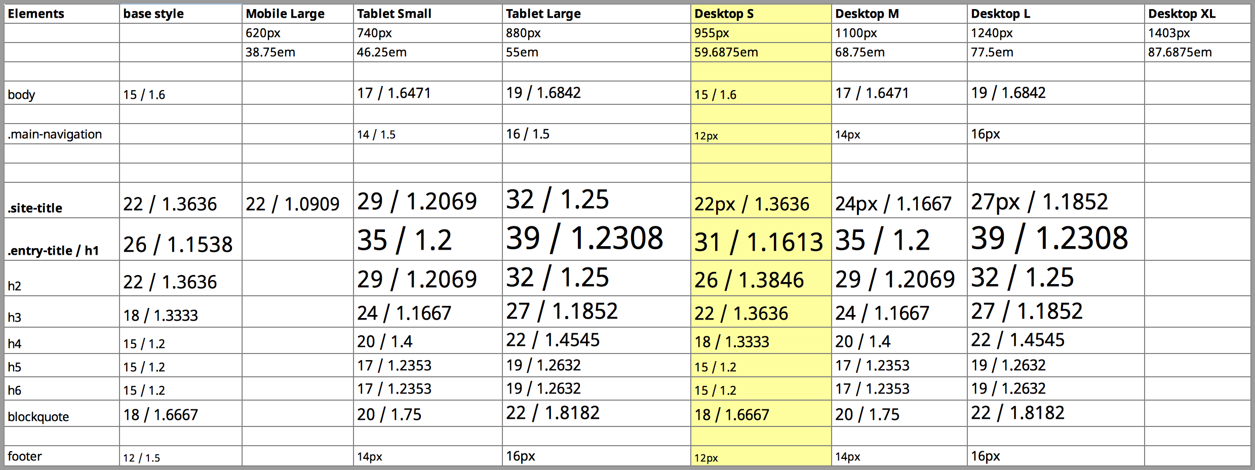
You can download it as a LibreOffice spreadsheet.
Conclusion: the font sizes of Twenty Fifteen are following a well-balanced modular scale that accomodates screen sizes from sub-740 to 1240+ pixels. If you want to make changes to the font size, you will need to create your own scale, and apply your changes to all five breakpoints… unless you change the font-size of the html element, which will globally affect the whole system.
Layout
The Twenty Fifteen theme has two layout modes (single column / with sidebar), the switch being triggered at the Desktop Small (955px) breakpoint.
A minor change occurs at Mobile Large (620px), where a margin is added to the main content: the .site-main container gets a vertical padding of 7.6923%, and .hentry gets a left and right margin of the same amount (7.6923%).
The major switch occurs at 955px (59.6875em). We now have two layout elements, “site-content” and “sidebar”:
.site-content :
float: left;
margin-left: 29.4118%; /* positioning tweak */
width: 70.5882%;
.sidebar :
float: left;
margin-right: -100%; /* positioning tweak */
max-width: 413px;
position: relative;
width: 29.4118%; /* starts at 280 pixels */
The sidebar reaches it’s max-width (413px) when the viewport goes above 1400px. At that point, the layout becomes fixed anyway, since there is a max-width for the global “site” container:
.site {
margin: 0 auto;
max-width: 1403px;
}
Layout tweaks: Javascript events
Some JavaScript events occur upon scrolling: when the user has scrolled to the bottom, the sidebar gets a style of “position:fixed ; bottom: 0;”. This has the result of always keeping the sidebar content in the viewport. The script is located in /js/functions.js, under “// Sidebar scrolling.”.
This explains some of the positioning tweaks, the “margin-left: 29.4118%” of the content and “margin-right: -100%” on the sidebar: they ensure that the layout still works when the sidebar becomes “fixed”.
Inner margins
The two main layout blocks, site-content and sidebar, have some internal padding. This is how it works:
The content of the sidebar (site-header, main-navigation, social-navigation…) gets a left and right margin of 20% each. This remains the same for all mediaqueries beyond the Desktop Small (955px) breakpoint.
Example:
.main-navigation {
margin: 0 20% 20%;
}
For the site-content, the margin is applied to the following elements.
.hentry,
.page-header,
.page-content {
margin: 0 8.3333%;
}
The resulting margin has the same width as the sidebar, for instance at 1200px:
- sidebar = 1200 * 29.4118% * 20% = 70.58832 px
- content = 1200 * 70.5882% * 8.3333% = 70.58791 px
In addition, the main content field has some inner padding:
.entry-content,
.entry-summary {
padding: 0 10% 10%;
}
Note: The layout is defined entirely using percentage values.